Effective Landing Pages are the key to unlocking online success, drawing in users with captivating design and compelling content. Dive into the world of high-converting pages that drive engagement and conversions.
In this guide, we’ll explore the essential elements of creating effective landing pages and provide valuable insights on optimizing them for maximum impact.
Importance of Effective Landing Pages

Having effective landing pages is crucial for online businesses as they serve as the first point of contact between a potential customer and a business. A well-designed landing page can significantly impact user engagement and conversion rates, ultimately leading to increased sales and revenue.
Examples of Successful Businesses
- Amazon: With its streamlined and user-friendly landing pages, Amazon effectively guides customers towards making a purchase, resulting in high conversion rates.
- Shopify: Shopify’s landing pages are optimized for lead generation and capturing customer information, contributing to their success in the e-commerce industry.
Impact on User Engagement and Conversion Rates
A well-designed landing page can captivate users’ attention, convey the brand’s message effectively, and provide a seamless user experience. This, in turn, increases the likelihood of users taking the desired action, such as making a purchase or signing up for a service. By optimizing landing pages for conversion, businesses can maximize their marketing efforts and drive tangible results.
Elements of a High-Converting Landing Page

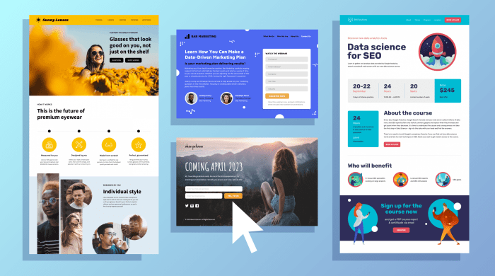
Creating a landing page that converts visitors into leads or customers requires careful attention to various elements that make up an effective design. From compelling headlines to eye-catching images, each component plays a crucial role in driving conversions and maximizing the impact of your landing page.
Headlines
A strong headline is the first thing visitors see on your landing page, so it needs to grab their attention and communicate the value of your offer quickly. Keep it concise, clear, and relevant to the content on the page. Use action-oriented language to encourage visitors to take the next step.
CTAs
The call-to-action (CTA) is arguably the most important element on your landing page. It should be prominently displayed, visually appealing, and clearly communicate what action you want visitors to take. Make sure it stands out from the rest of the page and use persuasive language to entice visitors to click.
Images
Visual elements, such as images and videos, can help engage visitors and convey information more effectively than text alone. Choose high-quality, relevant images that support your message and reinforce the value of your offer. Avoid using stock photos that look generic or unrelated to your content.
Forms
The form on your landing page is where visitors provide their information in exchange for your offer. Keep the form simple, asking for only essential information to reduce friction and increase conversions. Use clear labels and instructions to guide visitors through the form completion process.
Layout
A visually appealing and user-friendly layout is essential for a high-converting landing page. Use white space effectively to make the content easy to read and navigate. Organize the page in a logical flow, with a clear hierarchy of information that guides visitors towards the CTA. Test different layouts to see what works best for your audience.
Best Practices for Creating Landing Pages: Effective Landing Pages
When it comes to creating effective landing pages, there are certain best practices to keep in mind that can help you drive more conversions and achieve your goals. Avoid some common mistakes, conduct A/B testing, and optimize your pages for better results, and craft compelling copy that compels visitors to take action.
Avoiding Common Mistakes, Effective Landing Pages
- Don’t clutter your landing page with too much information; keep it clean and focused on the main message.
- Avoid using confusing or generic headlines that don’t clearly communicate the value proposition.
- Don’t forget to optimize your page for mobile responsiveness to ensure a seamless user experience.
- Avoid using too many form fields, as this can deter visitors from completing the desired action.
Importance of A/B Testing and Optimization
- A/B testing allows you to compare different versions of your landing page to see which one performs better and make data-driven decisions.
- Optimizing your landing page involves making continuous improvements based on data and feedback to maximize conversions.
- By testing different elements such as headlines, images, and CTAs, you can fine-tune your landing page for optimal results.
Writing Compelling Copy
- Focus on creating clear and concise copy that highlights the benefits of your offer and resonates with your target audience.
- Use persuasive language and compelling storytelling to create a sense of urgency and drive action.
- Include strong CTAs that clearly tell visitors what action to take next and make it easy for them to do so.
Mobile Optimization for Landing Pages
In today’s digital landscape, it’s crucial to ensure that your landing pages are optimized for mobile devices. With the increasing use of smartphones and tablets, a mobile-responsive design can make or break the success of your landing page.
Significance of Mobile-Responsive Design
Mobile optimization is essential because a large percentage of users access websites through their mobile devices. If your landing page is not optimized for mobile, you risk losing potential customers due to a poor user experience.
Tips for Optimizing Landing Pages for Mobile Users
- Use a responsive design that adapts to different screen sizes.
- Optimize images and videos for faster loading times on mobile devices.
- Keep forms short and easy to fill out on a small screen.
- Avoid using pop-ups that can be difficult to close on mobile.
- Ensure that all buttons and links are easily clickable with a touch screen.
Differences Between Desktop and Mobile Landing Page Design
When designing a landing page for mobile, you need to consider the limited screen space and the touch interface. Unlike desktop users, mobile users are more likely to scroll vertically, so it’s important to prioritize content accordingly. Additionally, load times are crucial on mobile devices, so make sure your landing page is optimized for speed.
